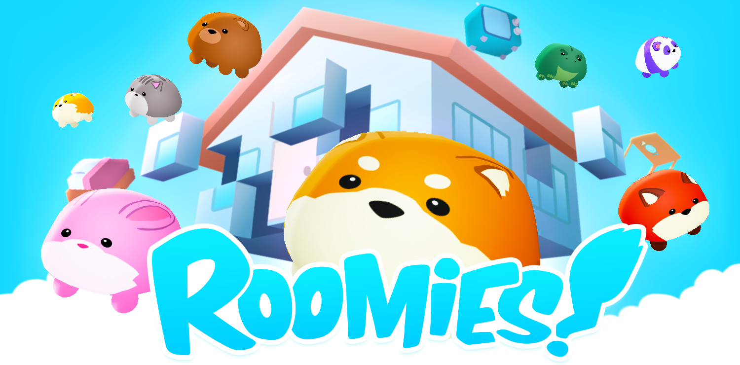
Roomies
Roomies - Designing All The Things
Hi Everyone!
My name is Kevin and I was the Designer for the Global Game Jam (GGJ) 2019 game, Roomies. I was responsible for game design, art direction, 3D texture painting, and UI design. Today, I have the pleasure of sharing the design side of creating Roomies with you all.
The Game Concept
"What Home Means to You" was GGJ's game theme this year. We began our process first with agreeing on some core desirables to guide our brainstorm. Some of these included:
- A unique but simple game mechanic with potential for great depth and scalability.
- Graphics requiring a proportional workload for 1 designer and 1 3D artist.
- Potential for some element of chaos.
- A unscripted aspect for variety and depth.
- Some kind of abstraction on the theme.
- Feasibility within the allotted time.
- And of course, gameplay we all felt would be fun.
Each game idea the team came up with was weighed against these ideals. After a few hours of creative brainstorming together and considering everyone’s ideas, I proposed what would become Roomies.
In discussing the idea, it became clear that we had something that not only satisfied a lot of what we were looking for but also seemed endlessly scalable.
Art Direction
Once we found our game idea, we broke down the tasks that would be involved in making it happen and prioritized. As Designer, my immediate task was to establish a art direction that could address all the challenges our unique game design and working circumstances posed. This included creating:
- A way to turn the unrealistic quality of the prominent square walls into a positive feature.
- A style that allowed for shared 3D models between different props.
- A solution for making large furniture feel good in a small square format.
- A character design that complimented the chubby walls and stood out on the board.
- A character design that could be easily repurposed.
- Minimal texture complexity in order to churn out assets quickly.
- A lively style to address the mundane nature of the furniture and walls.
- Something everyone on the team could get on board with.
After some research, I gathered a collection of mood board imagery which I first reviewed with Jon. After validating the viability of the direction as it pertained to 3D and further fleshing out the direction together, we presented it to the team to make sure everyone was happy with it.
Game Sitemap + Features
With art direction locked down, Jon was able to get cranking on the 3D models. I next worked briefly with Dan to figure out the screens and their features that would be necessary in our game. For the most part, we kept the screen count minimal and the features limited, however, we were excited by the idea of having a character select screen. We roughed out a quick lo fi wireframe of it alone (due to its higher complexity) and simply wrote out a quick outline of the rest.
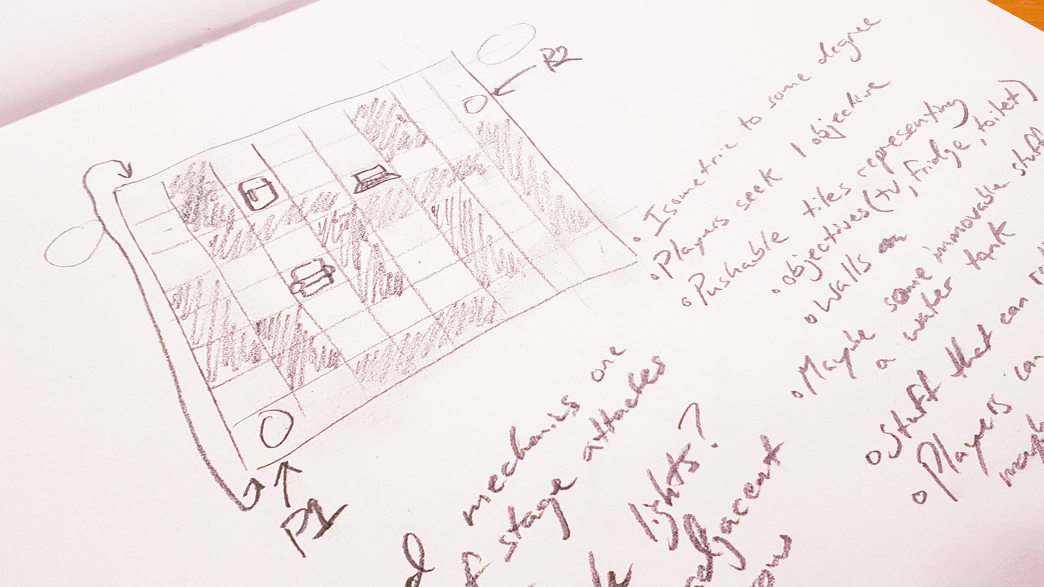
Stage Design
With Dan moving on getting the UI framework started, the next immediate task was to flesh out the stage design. Ryan needed clear direction for how large our first stage would be as well as an example of how to populate it with walls and props. In Photoshop, I created a quick and simple top-down color coded grid. Keeping it simple allowed me to iterate quickly through many possibilities.

The main challenges here were to:
- Make the stage resemble a home.
- Keep the stage densely populated in order for the game mechanic to work.
- Keep the stage small enough for the player camera to comfortably see everything but also large enough to give players a chance to challenge each other as they race to the goal.
Color Palette
After providing Ryan with what he needed on the stage design, I needed to quickly create and validate a more specific color palette for the game to inform how I would be painting the textures for all the 3D models Jon would soon be handing me. There simply wasn’t any room for fleshing out a thoughtful concept art to inform this. So in Photoshop, I painted a rough impression of the game space and took a quick stab at a UI element.

This loose glimpse into a possible game aesthetic would prove sufficient for validating a color palette direction.
3D Texture Painting
Once Jon started handing off stuff for me to paint, that essentially became my focus for the rest of the day. After handing off the character model (which the team agreed would be needed first), Jon and I revisited a list of props we had generated as a team during our brainstorm discussion.
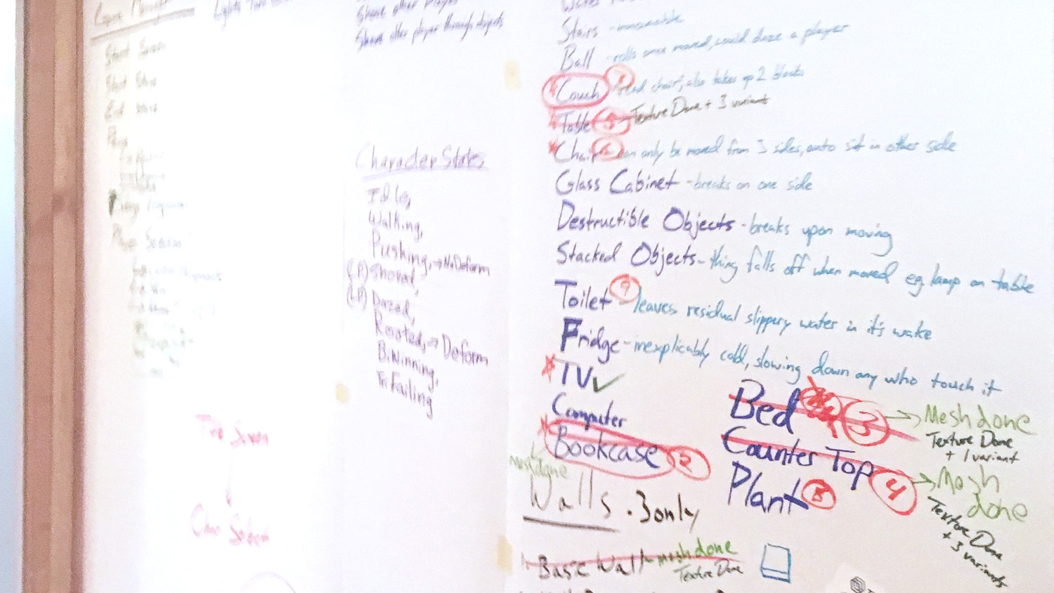
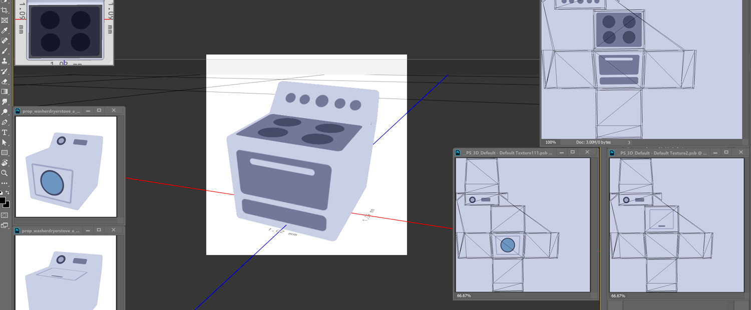
We reviewed what we had and prioritized based on what would provide the most value to the game. In our game’s case, the camera’s perspective and type of gameplay kept player attention more on the stage as a whole rather than on any individual prop. We determined that focusing on variety (however simple) would provide a greater impression of quality. We strategically prioritized any props that could share the same model and only created 1 of the elaborate props we had in mind to be used as a stage’s objective. We collaborated on the model designs and iterated quickly and briefly when necessary.
With Jon well underway on generating as many props as he could for the rest of the day, I imported the OBJs Jon provided into Photoshop and began painting. Once I had 1 character design, I built right on top of it repurposing whatever elements I could to quickly generate more character options.
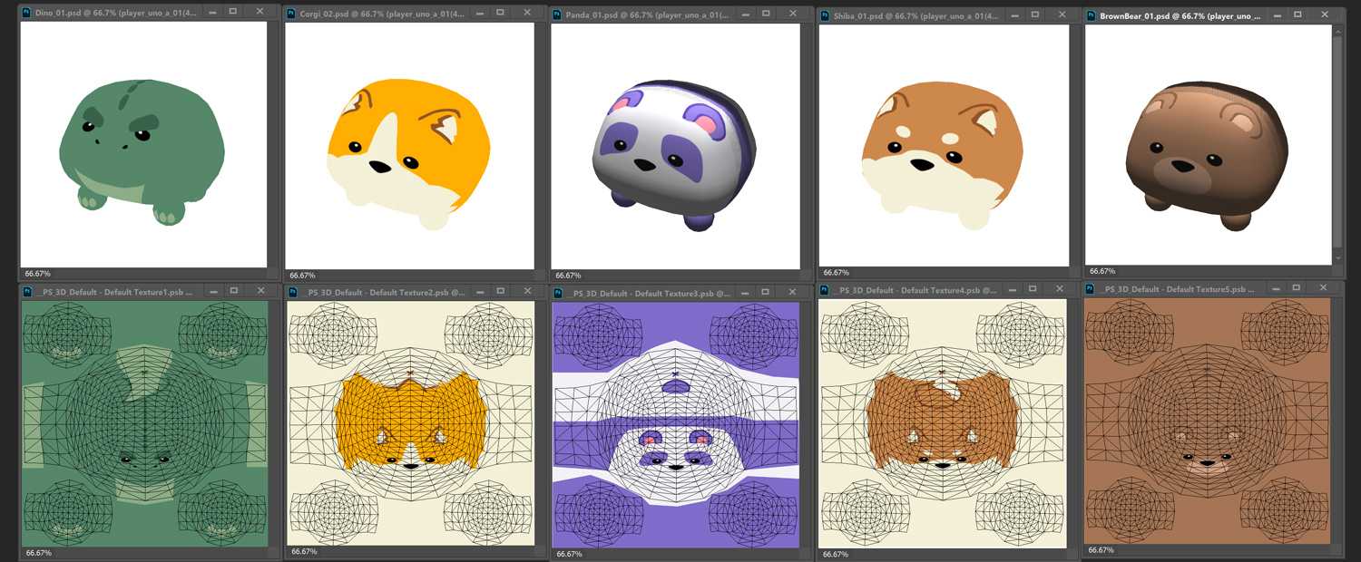
My choices for the characters were based on my wife’s and daughter’s favorite cute animals. After the characters came the walls, then floor, and then props.
I leveraged the colors from my loose mockup directly for this. When I needed more color options, I sourced the mood board imagery for it.
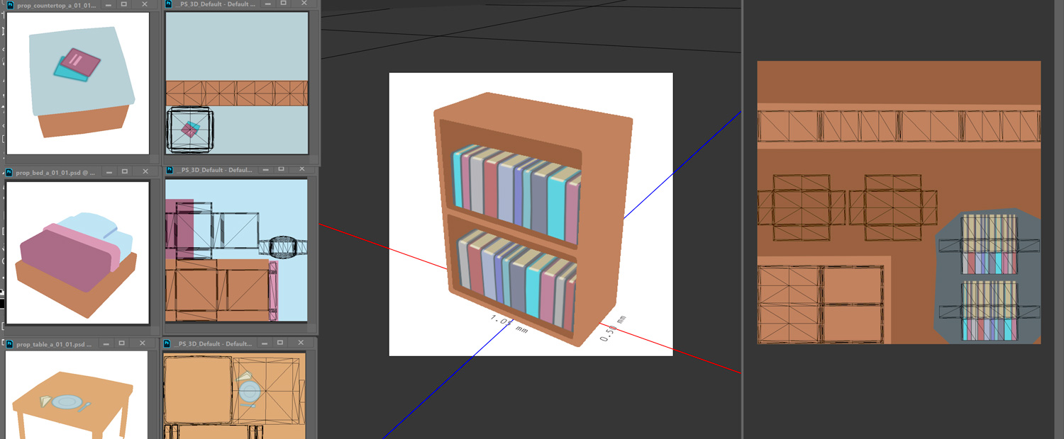
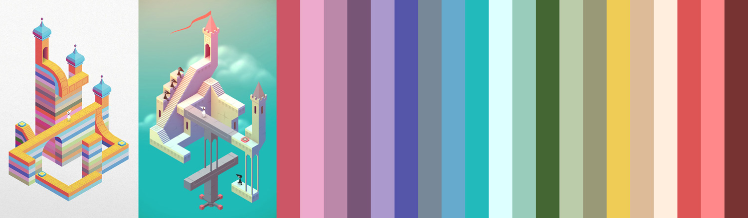
I focused most of my color referencing from Monument Valley which is a beautiful game we’re all fond of. Props like tables and counters were stretched for variety by adding the illusion of various additional items to them.
UI Design
The next and final day was spent designing the UI. Do to lack of time, I took the idea for the “Get” call out in the mockup from the day before and simply repurposed it for every screen.
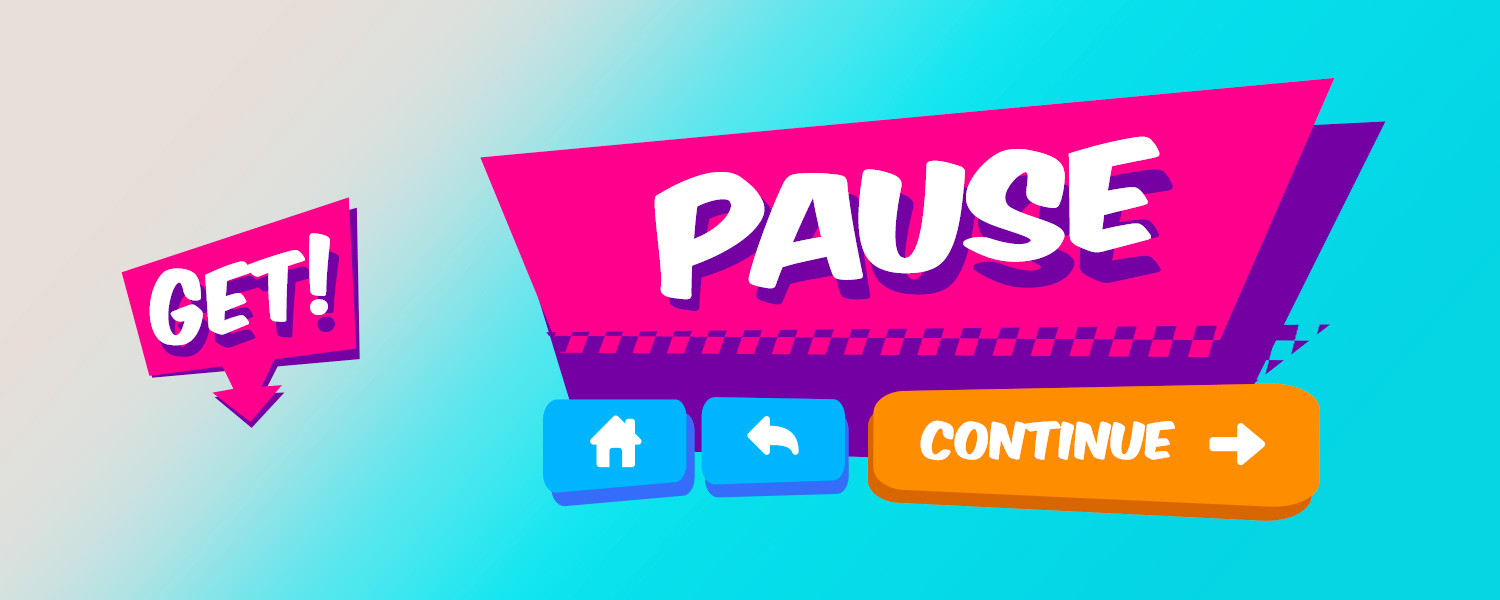
I added a primary panel accent detail and a primary and secondary button style. I leveraged royalty free fonts and icons from dafont.com and iconfinder.com respectively. To minimize complexity, the choice was made to forgo hover/pressed button states and just have every screen exported as flat full screen images which Dan would then lay invisible buttons on top of where the designed buttons were to make them appear interactive. The Character Select screen was of course an exception that required multiple parts. As the deadline approached, it became clear that not all things in the UI would be able to make it in, so Dan and I worked together to seek compromises that at least polished up what couldn’t make the cut.
By submission we had created something fun and visually engaging. It was almost hard to believe what we had accomplished. I definitely enjoyed the privilege of working with 4 fine talented jammers. I would love to continue making Roomies into a legit game.
Thanks for reading! Please feel free to ask any questions relating to the design of Roomies in the comments section below.
Leave a comment
Log in with itch.io to leave a comment.